THANK YOU FOR YOUR REQUEST
You will soon be contacted by our brand ambassador and product specialist.

Pantone 2022 Very Peri has a sprightly, happy attitude and dynamic presence that stimulates brave creativity and inventive expression. It embodies the traits of the blues while also having a violet-red undertone. With a carefree and confident display and a daring curiosity that animates our creative sprite, the Pantone 17-3938 Very Peri is inquisitive and intriguing, helping us embrace landscapes of possibilities, opening us up to a new vision as we rewrite our lives. Pantone 17-3938 rekindles gratitude for some of the virtues that blue represents, complemented by a new perspective that rings true today. Very Peri casts a new light on the future.
See Also: Modern Decorating Ideas for Your Dining Room: Fierce & Nature Inspired
We are living in a period of transition. Very Peri (PANTONE 17-3938) is a representation of the current global zeitgeist and the transformation we are seeing. Our conceptions and norms are shifting as we emerge from a period of profound seclusion, and our physical and digital lives have fused in new ways. Digital design allows us to push the boundaries of reality by allowing us to enter a dynamic virtual environment where we may experiment with and develop new colour combinations. PANTONE 17-3938 Very Peri highlights the merging of modern life and how colour trends in the digital world are manifesting in the physical world and vice versa, thanks to gaming patterns, the growing popularity of the metaverse, and the growing artistic community in the digital environment.

“The Pantone Color of the Year reflects what is taking place in our global culture, expressing what people are looking for that colour can hope to answer,” added Laurie Pressman, Vice President of the Pantone Color Institute. “Creating a new colour for the first time in the history of our Pantone Color of the Year educational colour program reflects the global innovation and transformation taking place. As society continues to recognize colour as a critical form of communication, and a way to express and affect ideas and emotions and engage and connect, the complexity of this new red-violet infused blue hue highlights the expansive possibilities that lay before us”.


Here you find a modern hallway with BRYCE FAUX II Console. Bryce is a giant natural amphitheatre caused by erosion through the Paunsaugnt Plateau. The BRYCE FAUX II Console pays tribute to this plateau through its unique design in faux-marble painting. It is a plus to any home entryway or even as a plus in the living room or dining room.

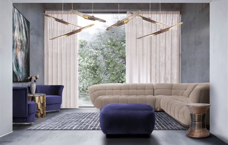
This living room design provides a sense of harmony and freshness to those who enter this space through a neutral colour scheme combined with a natural pop of green. So, the ESSEX Corner sofa together with the PADAUNG stool and even the curtains combine perfectly with the green of the OTTER Ottoman and the ELK Armchairs, creating a balanced and harmonious environment.
Elegance is the perfect definition for this contemporary kitchen, given its clean lines, that mixed with the purple Nº20 counter stools, filled the space with greater enjoyment, bringing moments where laughs and conversations flow seamlessly.

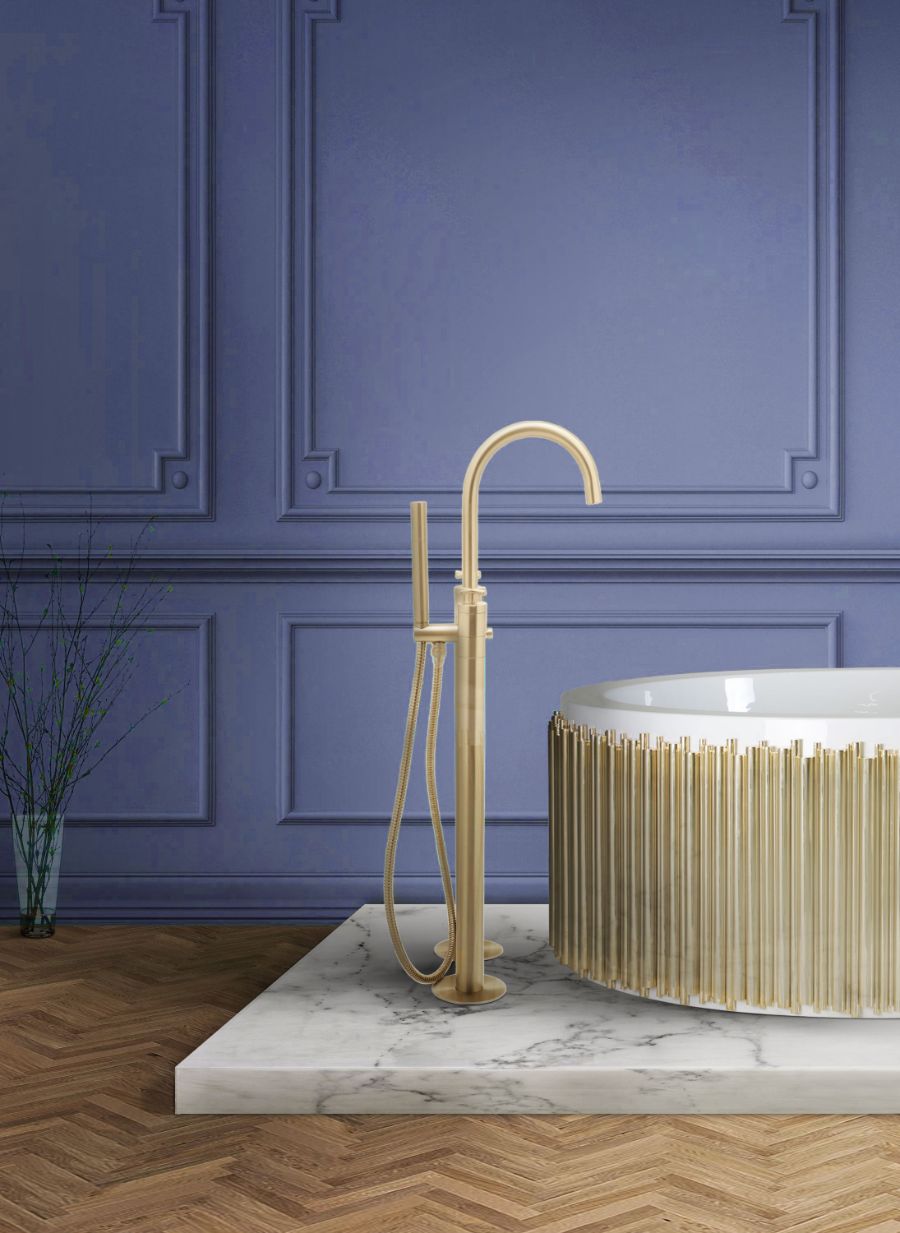
NAU Mounting Floor Mixer Tap is a staggering modern floor mixer tap. This product stands out for its contemporary look that completely shines bright when paired with the right colours and shapes, truly a unique and dazzling item to admire. This streamlined stand-alone mounting floor tap from Maison Valentina‘s ATO Collection is a quintessential piece for any luxury minimalist bathroom.
See Also: Find A Colourful Dining Room Decor With These Fantastic Ideas

What did you think about this article on Pantone 2022? Stay updated with the best news about trends, interior design trends, and furniture high-end brands, you must sign up for our Newsletter and receive it in your email – free of charge, the latest and the most exclusive content from BRABBU Blog. Follow us on Pinterest, Instagram, Facebook and Linkedin!
Subscribe to our newsletter!