THANK YOU FOR YOUR REQUEST
You will soon be contacted by our brand ambassador and product specialist.
THANK YOU FOR YOUR REQUEST
You will soon be contacted by our brand ambassador and product specialist.

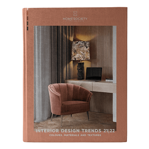
Pantone LLC is the world-renowned authority on color, provider of color systems and leading technology for the selection and accurate communication of color across a variety of industries. The PANTONE name is known worldwide as the standard language for color communication from designer to manufacturer to retailer to customer. The PANTONE selected the main colors that will be part of this Fall 2016, named FALL 2016: A Unity of Strength, Confidence and Complexity. BRABBU shows you some suggestions of fabrics for fall 2016, from brands that will be present in Paris Déco Off 2017, in trendy pieces for this season that will make an amazing modern interior design!
SEE ALSO: Francis Sultana – Luxury Interiors With Bold Colours
RIVERSIDE
Earmarking the importance of Blue in the palette, the new blue shade of Pantone 17-4028 Riverside undeniably takes precedence in the fall collections. This colour is cool and calming, strong and stable and displays a subtle vibrancy and sophistication.
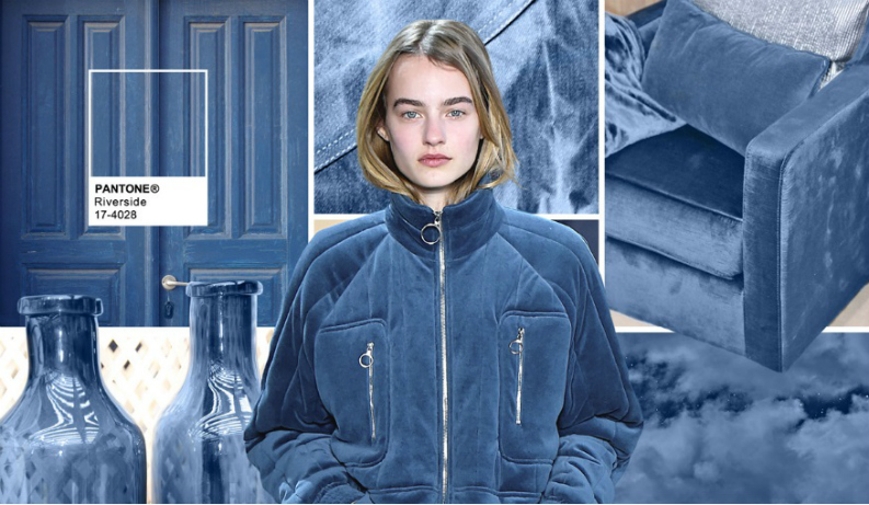

Fabric – ZIMMER + ROHDE Cover
AIRY BLUE
Pantone 14-4122 Airy Blue’s lofty nature evokes feelings of lightness and freedom.


Fabric – DESIGNERS GUILD: MONTICELLO FABRICS Sarasota – Cobalt
SHARKSKIN
There’s an edge to Pantone 17-3914 Sharkskin, and yet it manages to remain neutral.

Fabric – ALDECO Siége
AURORA RED
In contrast to the stable backbone of the Fall 2016 palette, Pantone 18-1550 Aurora Red adds a welcome punch.

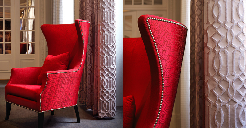
Fabric – ALDECO Hoopstar 14 Coca Cola Red
WARM TAUPE
Pantone 16-1318 Warm Taupe is a hearty, pleasing and approachable neutral that pairs well with each of the top 10 shades of the Fall 2016 season.
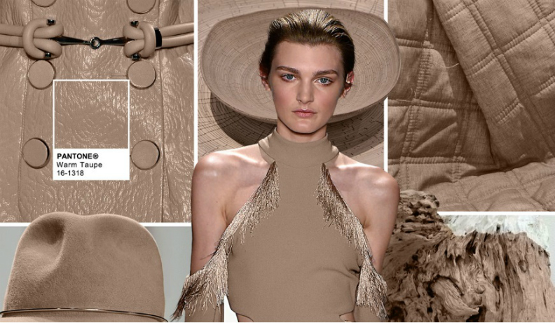

Fabric – ALDECO Ryad Dyor 3
DUSTY CEDAR
Like Airy Blue, Pantone 18-1630 Dusty Cedar gives a nod to the Pantone Color of the Year 2016, Rose Quartz.
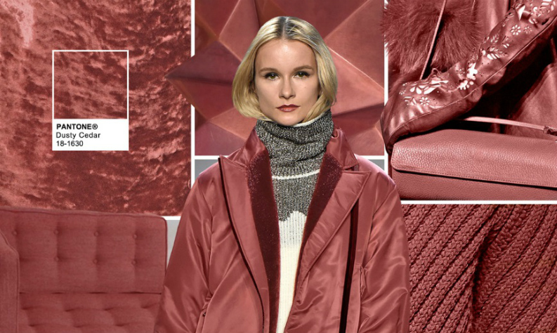
Fabric – CASAL Suchet Rouge Empire
LUSH MEADOW
Pantone 18-5845 Lush Meadow brings to mind fresh botanicals and foliage. This shade displays a brightness, panache and depth of color that elevates it from more natural greens.

Fabric – DECORTEX 4254
SPICY MUSTARD
Bounces elegantly off other colors in the palette, Pantone 14-0952 Spicy Mustard is an exotic addition.
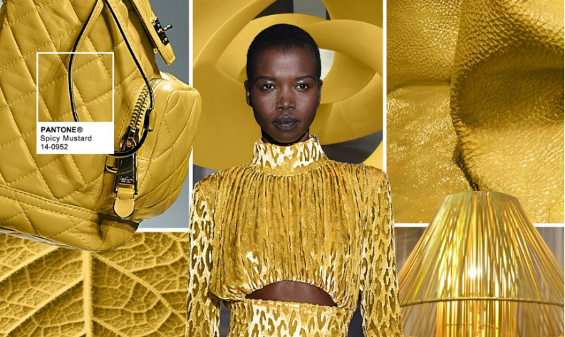

Fabric: ALDECO Misted Yellow
POTTER’S CLAY
Pantone 18-1340 Potter’s Clay has an added degree of sophistication and layering. Elements of russet Orange in its undertones, gives a grounded feeling that’s anything but flat.


Fabric – DECOBEL: Minerva 4260-06
BODACIOUS
Pantone 17-3240 Bodacious speaks to the gender fluidity we continue to see. This colour is versatile and can be used with Pinks and Reds. Bright, rich Purple, with hints of a more sophisticated Pink. (bullfrogspas.com)

 Fabric – DECOBEL Eracle 05
SEE ALSO: Decorate with Rainbow Colour Counter Stools
>> What do you think about this article? Please, leave your comment below. If you want to be up to date with the best news about trends, interior design tips, and furniture luxury brands, you must have to sign up our Newsletter and receive in your email, free of charges, the latest and the most exclusive content from BRABBU Blog.